There’s a moment, early in any rebuild, when you open the old site next to the blank new one and realise the blank one is the more honest document. The old iamarchie.com accumulated things the way a desk accumulates paper: a page added here, a service listed there, sections that made sense in the year I wrote them and survived mostly because nothing forced me to defend them. A template would have let me carry all of that across untouched. That’s exactly why I didn’t use one.
I’m rebuilding the site manually in Sitely — the app many people still know as Sparkle — placing every block myself. It’s slower. It’s also the point. When you drag each section into place by hand, you can’t pretend a paragraph earned its spot just because it already existed. Every element has to argue for itself, in the present tense.
The first cut is the hardest, and it isn’t visual
People assume a redesign starts with colour. Mine started with deletion.
My background doesn’t fit on one line, and for years the site tried to solve that by listing everything. I’ve worked across SEO and content, design, and digital community projects. I’ve taught English online on TutorABC since 2016. In September 2023 I began an MFA in Design and Visual Communications at Falmouth University. That’s a lot of doors into the same house, and the old site opened all of them at once, which is another way of saying it opened none of them.
The rebuild forced a ranking. Not of what I’ve done — of what the work actually is, seen from the outside. A visitor doesn’t arrive carrying my whole history. They arrive with one question, usually, and the homepage either answers it or wastes their time. Cutting wasn’t about hiding parts of the background. Teaching still shapes how I write and how I think about an audience; the SEO years are why I can’t look at a page without seeing its structure. But the site has to lead with the work as it stands now, not as an archive of everything it’s ever been.
Why the résumé lives on the homepage
Most people bury their résumé three clicks deep, on a page called something like “About” or, worse, “Learn More.” I put mine on the homepage.
The homepage of iamarchie.com is the résumé — one version, in international English, readable by someone in Rotterdam, New York, or anywhere else, with a downloadable PDF for the people who still want the document on paper or in an inbox. I split my time between Rotterdam and New York, and my work has never belonged to one market, so maintaining a Dutch version and an American version and a slightly different third version felt like the old site all over again: more pages, less honesty. One version means I have to write sentences that are simply true, without leaning on what a particular audience expects to hear.
It also changes the discipline of the thing. A résumé page can be a warehouse. A homepage can’t. If the first screen someone sees is also your professional record, every claim on it has to be one you’d say out loud in an interview. No inflation survives that test for long.
Turquoise, yellow, white — and a lot of empty space
The visual identity stayed what it was: turquoise, yellow, and white, strong typography, generous spacing. I didn’t keep it out of nostalgia. I kept it because rebuilding by hand separates the things that were decisions from the things that were defaults. The colours were a decision. The clutter wasn’t.
Spacing is the part people underrate. On the old site, white space was whatever was left over after I’d fitted everything in. On this one, it’s placed — gaps I chose, on purpose, because the pause between two ideas is part of how the page reads. Typography does similar work. When the type is strong and the layout is quiet, weak writing has nowhere to hide. I’ve rewritten more sentences during this rebuild than in any purely editorial pass, because a paragraph sitting alone in open space either holds up or it doesn’t.
What the MFA has to do with a website
Studying design formally, partway into a career spent mostly making things, does something uncomfortable to your own back catalogue. Falmouth has given me a vocabulary for choices I used to make on instinct — and, occasionally, evidence that the instinct was wrong. The rebuild is where that lands in practice. It’s one thing to study visual communication; it’s another to open your own homepage and apply the same critique you’d apply to anyone else’s, knowing the PDF version will carry the same words into rooms you’ll never be in.
So the site is being rebuilt slowly, by hand, one argued-for section at a time. Some of it is still in progress, and I’d rather show that than hide it behind a template that makes everything look finished. A handmade thing shows its seams. For a site that’s supposed to represent how I work, that seems right.
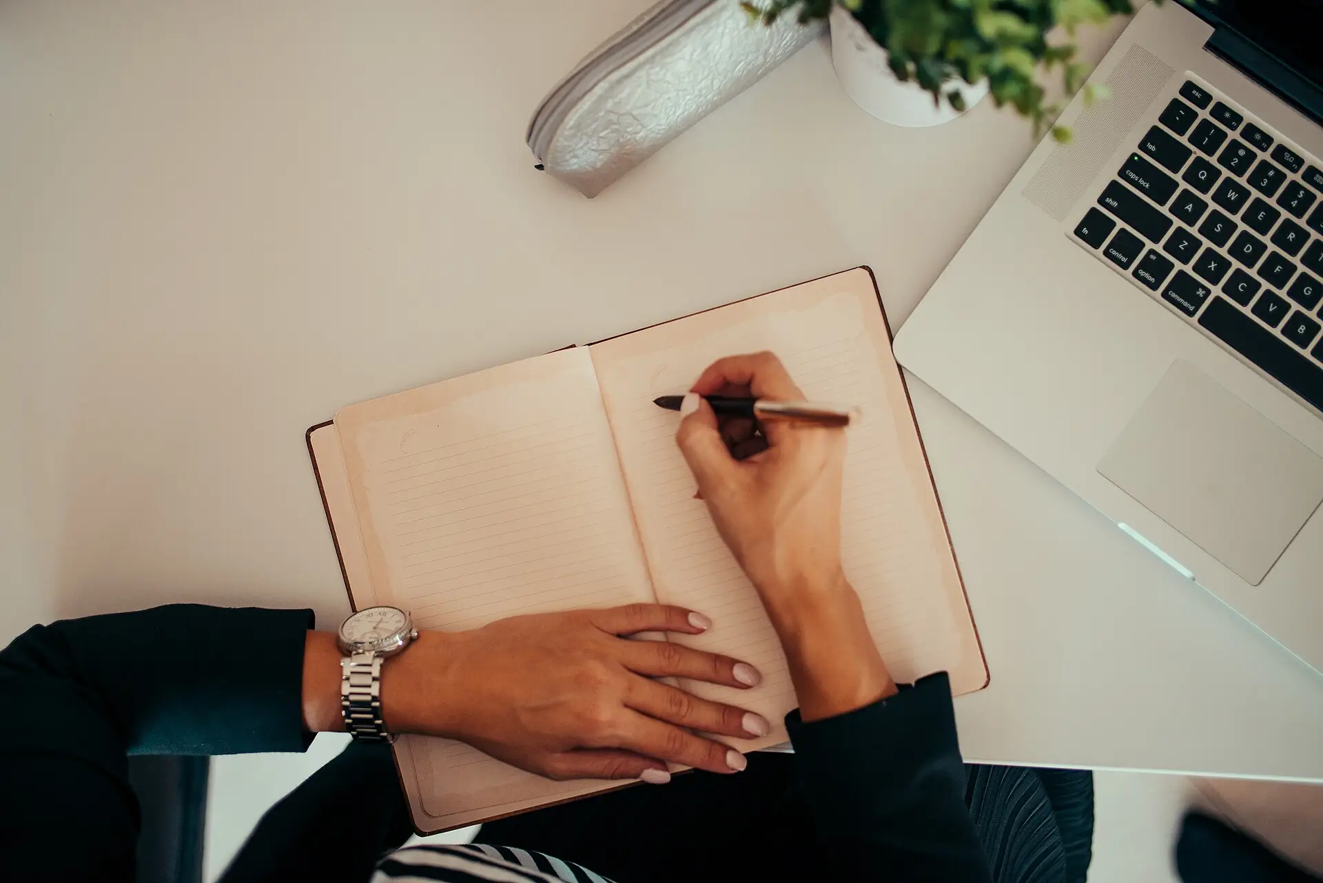
Featured image: a person writing in a notebook beside a laptop at a modern workspace. Photo by Shixart1985, via Wikimedia Commons, licensed under CC BY 2.0. Source: https://commons.wikimedia.org/wiki/File:Person_writing_in_notebook_while_using_laptop_at_a_modern_workspace.jpg