
You can photograph the Cube Houses in ten seconds. Living in one takes longer.
From Overblaak, the yellow cubes read as a trick: boxes tipped onto a corner, balanced over a busy road in the middle of Rotterdam. I live in this city, and they still stop me — not because they look strange, exactly, but because they look so confident about it. Then you start asking the duller, better question. Where does the sofa go?
A forest, if you squint the way Blom wanted
Architect Piet Blom showed the plans in 1978, and the complex was built between 1982 and 1984 above the Blaak, beside the Oude Haven. There are 38 small cubes and two larger super-cubes, each one set on a hexagonal pylon that holds the entrance and the stairs.
Blom meant each house to read as a tree. Together, they were a wood — the Blaakse Bos, the Blaak Forest — and the point wasn’t decoration. He wanted a village inside the city: shops and workshops below, a traffic-free deck, homes lifted clear above it all. Blom had studied under Aldo van Eyck and worked in the Dutch Structuralist habit of building something large out of small, recognisable parts, so the place stayed at human scale.
That’s the public story. The private one starts at the front door.
The floors are flat. Nothing else is.
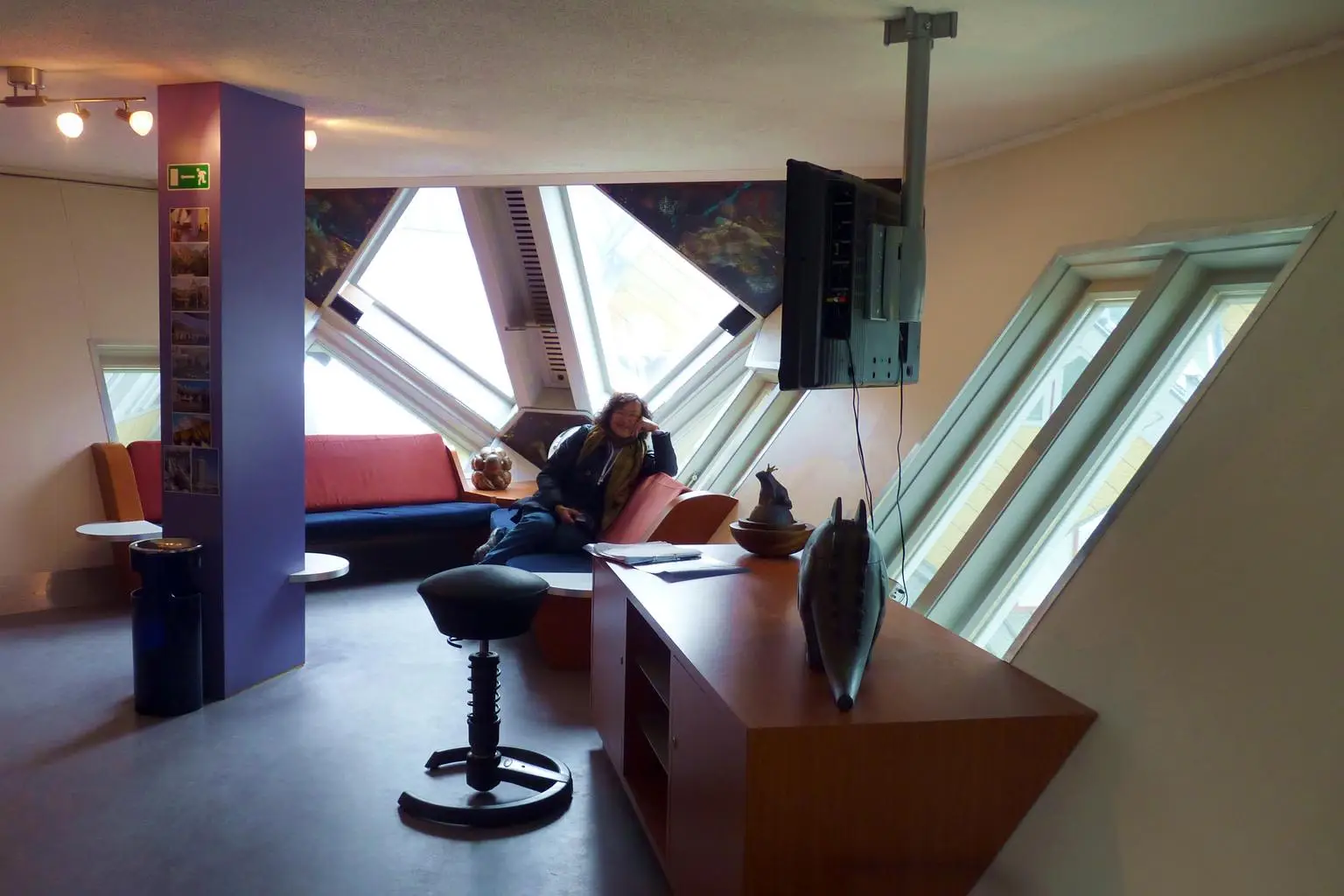
Each cube is rotated onto one corner, so the walls and windows sit at 54.7 degrees. The floors stay horizontal — you’re not living on a slope — but the enclosure leans in on you from every side.
A house measures about 100 square metres. Roughly a quarter of that is lost under the angled ceilings, which means the number on a floor plan lies to you in a very specific way. A normal room wastes space at the edges. A cube room is edges.
The layout climbs through three named levels. Down low is the straathuis, the street house: kitchen and living room, windows looking down toward the pavement. Above it, the hemelhuis — the sky house — holds bedrooms, a bathroom and a study, its windows turning upward. At the top sits the loofhut, the leaf hut, a three-sided pyramid room meant as a conservatory and ended up, over a noisy road, as a closed room full of tilted glass.
As a sequence, it’s clever. You move from street to sky as you climb. As a place to put a wardrobe, it’s a negotiation.
Furniture loses its default settings
Most interior design quietly assumes right angles. Shelves assume a wall will meet them flush. A bookcase assumes it can stand tall without its top corner disappearing into a ceiling that started descending halfway up.
None of that holds here.
Inside, furniture has to negotiate narrowing edges, and floor area stops telling you much about usable headroom. Where a table can sit, where you can stand without ducking, where storage can go without eating the one stretch of room that feels open — those become the design decisions, not afterthoughts you sort out on moving day. The steep, narrow stairs between levels add their own condition: this is a home spread vertically, and it asks more of your knees than a flat ever would.
Residents have answered with the obvious tools, pushed harder: built-in pieces that follow the slant instead of fighting it, low furniture under the lowest ceilings, storage treated as architecture. One owner, tired of passers-by peering in, turned his cube into the Kijk-Kubus, a show house furnished as a normal home and open to visitors — the easiest way to see how many of the compromises stop looking like compromises once a room is set up around them.
What holds the trick up
The balancing act is less daring than it looks. Reinforced concrete pylons and floors carry a timber-frame cube, clad in fibre-cement panels with rock wool inside for insulation. Concrete does the standing. Wood does the enclosing. The hexagon at the bottom isn’t just a trunk in Blom’s forest metaphor — it does real work, holding the stair, the entrance and storage at deck level.
Later changes kept testing the geometry. A 1997–98 renovation added zinc roofing over the original shingles. One super-cube became a Stayokay hostel in 2009 — proof a shape this awkward can absorb a completely different use, bunks and all, if the basic section works.
The lesson I take from it, as a designer
Studying design — I’m partway through an MFA in Design and Visual Communications at Falmouth, begun in September 2023 — has made me suspicious of buildings that photograph well and explain badly. The Cube Houses explain themselves constantly. Every slanted wall announces the idea and presents the bill for it in the same gesture.
That’s a useful discipline to steal, even if you never live anywhere stranger than a rectangle:
- Measure headroom, not just floor area. A room is a volume. Plans pretend otherwise.
- Let storage do architectural work. In a tight or awkward space, a cupboard isn’t furniture; it’s a wall that earns its keep.
- Design for the view the window actually gives you. Here, that’s the street below or the sky above — never the neutral straight-ahead view most rooms default to.
- Decide what the room refuses to do. A cube gives up tall shelving and easy stairs. Naming the refusal early beats discovering it with a sofa stuck in the stairwell.
Would I live in one? I honestly don’t know. The houses were built as an argument — that density could feel like a village, that a bridge could hold homes, that a city rebuilding itself didn’t have to be grey about it. Arguments make demanding hosts.
But walk the Overblaak deck at dusk, lights coming on in windows that lean toward you and windows that lean away, and the argument stops being abstract. Somebody is cooking in there. Somebody found a place for the bookshelf.
Sources
- Kubuswoningen / Piet Blom — Architecture Lab
- Cube Houses — Dominik Gehl Photography
- Cube house — Wikipedia
- Rotterdam’s Cube Houses: A Village Built Above the Street — ArchUp
Featured image: living room of a Cube House in Rotterdam, showing the slanted walls and windows. Photo by Cmglee, via Wikimedia Commons, licensed under CC BY-SA 3.0. Source: https://commons.wikimedia.org/wiki/File:Rotterdam_Cube_House_living_room.jpg