
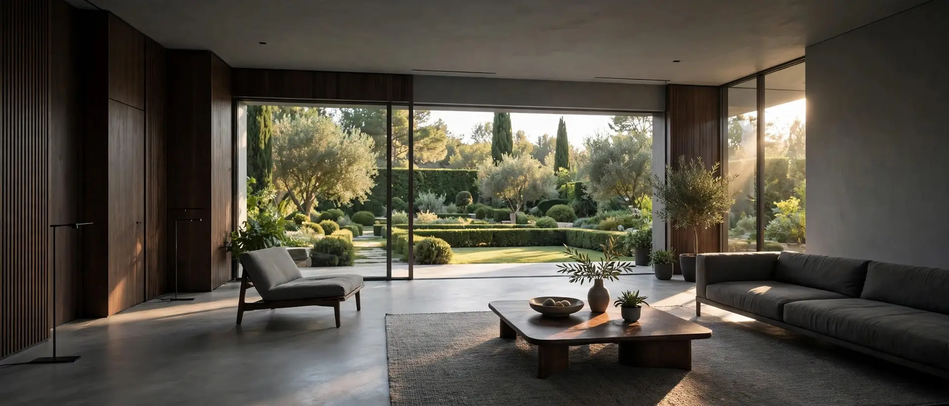
The best compliment the Park house ever got came as a question. At Cannes, jury president Alejandro González Iñárritu asked Bong Joon-ho where the production had found it. He assumed it was real.
It wasn’t. Not the Park house, not the Kims’ semi-basement flat, not even the street outside the Kims’ window. Production designer Lee Ha-jun built all of it, and the team kept that fact quiet until after Cannes because Lee believed the set — which carries most of the film — should never read as a set. He was nervous someone would spot it. Nobody did.
That invisibility wasn’t luck. It was a method, and it started with an admission: Lee is not an architect, and he didn’t design like one.
Blocking first. Architecture second.
Bong’s scripts describe where every actor moves in a scene. So Lee started from movement, not floor plans — though Bong did hand him a simple floor plan sketched while writing the script, plus one non-negotiable: the garden had to be beautiful.
“For me blocking and framing are prioritised,” Lee told Dezeen. “Architects build spaces for people to actually live in.” A production designer builds for a lens, a crew, and a story that has to read in a single pass. Lee talked to architect friends, looked at minimal modern houses, played with his son’s Lego. He avoided copying one architectural style.
You can feel that priority in the proportions. The house is wide and deep rather than tall because Lee designed it to suit the 2.35:1 aspect ratio. The living room’s great glass wall was sized to that ratio too, so room and garden would sit inside the frame “like a nice photograph.” There’s no TV in that room. In the fiction, the architect who supposedly designed the house wanted the residents looking at the garden. In practice, Lee wanted you looking there too.
Sunlight got the same treatment. Before building, Lee and cinematographer Hong Kyung-pyo visited the outdoor lot repeatedly to track the sun’s movement, then placed the house and sized its windows around what they found. Bong has put the logic bluntly: the poorer you are, the less sunlight you get. The Parks get it all day. The Kims, in their semi-basement, get maybe fifteen or thirty minutes. Light, in this film, is income.
One staircase, built to be descended in a single breath
The most expensive decision sits underground.
The kitchen stairs, the basement storage room, the secret passage and the bunker below it were built as one continuous set on a sound stage, stacked so the descent happens in real vertical space. Lee called the idea “a bit ridiculous” at first. Bong wanted the move down filmed without stopping, so the actors’ breathing would stay real — and it worked. You hear people go down into that bunker the way you’d hear them go down into a cellar. Because they are. The vertical stack is also the film’s whole argument, drawn in section. The Parks mostly go up. The Kim family and the man hidden in the bunker go up and down, over and over. Lee wanted “increasing and suffocating density” as you descend — more clutter, more colour, less air. The staircase isn’t a motif pasted onto the story. It’s the story, built.
The other house got grease, salvage and a flood tank
Down at the bottom of that argument, the design language flips.
The Park interior is restrained on purpose: dark wood, grey walls, a limited palette, furniture made with Korean designers — including the low, multi-level living-room table the Kims hide under — and no recognisable brands, because a logo would break the spell. Even the cupboard hiding the secret passage was aged as an untouched wine store, so no viewer would guess it could move.
The Kim home has no master plan at all, by design. Lee based it on a semi-basement he had lived in as a student, built the flat and its neighbourhood on a water tank set in Ilsan so it could be flooded for the storm sequence, then drained, cleaned and repapered for the morning after. His crew salvaged doors, windows and gates from condemned sites because, as he put it, there’s a feeling of the passage of time that you can’t design. For the kitchen, they held pork belly barbecues in it — deliberately spattering grease — until the room stopped looking dressed and started looking used.
Wealth, here, isn’t shown by adding expensive things. It’s shown by subtraction: fewer objects, more light, more empty floor. Poverty isn’t shown by mess for its own sake either. It’s density — of things, of people, of years stuck to a wall.
What I’m stealing from it
I’m partway through an MFA in Design and Visual Communications at Falmouth, begun in September 2023, and I keep coming back to this production because it reverses the order most of us were taught. Brief first, ego later. Lee’s house works because every choice answers a prior question: Where does the camera stand? Where does the sun land at four? How long can an actor hold a descent before the cut? Three habits worth taking into any design work, film or not:
- Design for the movement through a space, not the photograph of it. Blocking is just user journey with higher stakes.
- Treat light as a material with a budget. Lee spent his on one garden window and starved the semi-basement. The contrast does the storytelling.
- Decide what the audience must never notice. A brand, a movable cupboard, a set that looks like a set — Lee designed those absences as carefully as the furniture.
A set that fools a Cannes jury isn’t a triumph of realism, exactly. It’s a triumph of restraint: a house built backwards from how people would move, look and breathe inside it, then disciplined enough to hide the work. Most real houses never get designed that honestly.
Sources
- Parasite house designed from “simple floor plan” by Bong Joon-Ho — Dezeen
- How ‘Parasite’ Director Bong Joon Ho Built That Amazing House — No Film School (reporting IndieWire interviews)
- How ‘Parasite’ production designer Lee Ha Jun built the film’s iconic house — Screen Daily
- Go inside the architecture of South Korean film ‘Parasite’ — The Spaces