Listen to this article
Take the story with you. Choose a voice and a pace that suits you.
Or listen in another language / choose a voice
Getting your device voices ready…
The voice follows the displayed language and your browser’s regional preference when available. You can choose another narration voice.
If you want to learn how to build a brand identity system, start by forgetting the single file most people ask for first. A logo alone does not make a website, an invoice and an Instagram post feel like they came from the same place. The system does. It is the set of decisions you make once, write down, and reuse every time something new has to be made.
I learned that while rebuilding this site by hand. Turquoise, yellow and white were easy to pick. Making them behave the same way on a homepage that doubles as my online résumé, on a blog post, and on a phone screen took rules, not taste.
Brand identity vs logo: one mark, one system
The brand identity vs logo question trips up almost every first brief. A logo is a single mark — a wordmark, a symbol, or both. Its job is recognition at a glance, even at 16 pixels.
A brand identity is wider. As Shopify’s guide to brand identity puts it, it is the collection of visual and verbal elements a business creates to represent itself: logo, colours, typography, imagery and voice. One studio put it more bluntly — a logo without an identity is a flag without an army — in Creature of Habit’s comparison of logo design and brand identity.
The brand itself is a third thing. That lives in people’s heads. You do not deliver it in a folder.
How to build a brand identity system, step by step
Work in this order. Skipping ahead is how palettes get chosen before anyone knows what the brand should say.
First, write the foundation down. Who is it for, in specific terms? What should it feel like? What should it refuse to look like? Shopify’s process starts in the same place: values, mission and audience before any visual design. Three honest sentences are enough. Vague foundations produce vague logos.
Second, look at the category. Note the colours and type competitors share. A shared colour can signal belonging. It can also make you disappear.
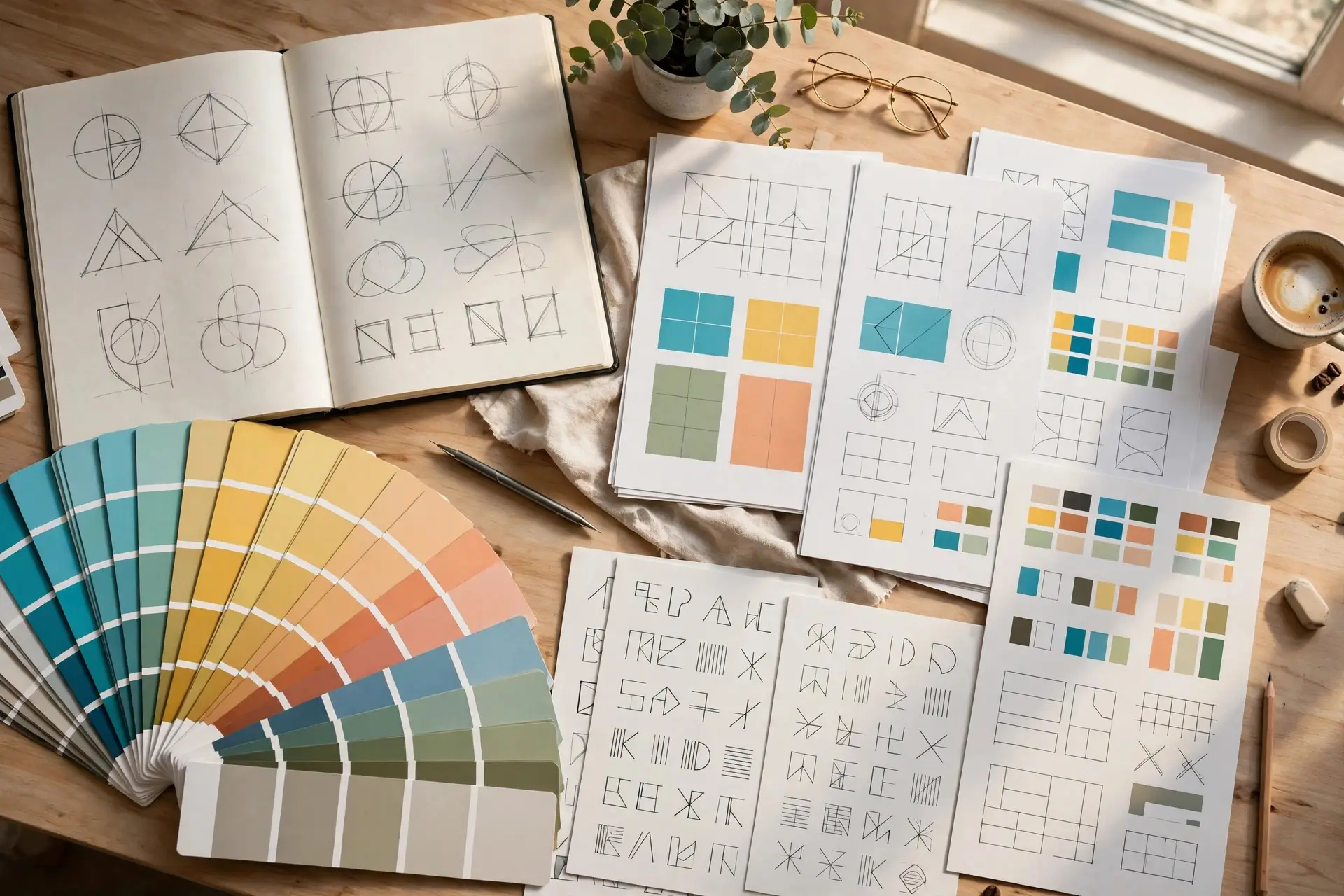
Third, design the visual system as a connected set, not separate shopping trips. That is the core lesson in Giftbox Creative’s guide to what a brand identity system is: logo, colours, fonts, photos and words are pieces of one puzzle, and they have to fit.
Fourth, build the everyday templates — social posts, a slide deck, an email header, an invoice. If the templates fight the rules, the rules are wrong. Fix them now, while it is cheap.
Last, document it. A short guide beats a beautiful folder nobody opens: logo versions and clear space, colour codes, type sizes, imagery direction, voice examples. If someone else can make a correct page without asking you, it works.
The brand identity system components that have to agree
The brand identity system components are five:
A logo system, not a logo file. Primary lockup, a horizontal version for headers, a stacked version for square spaces, an icon for favicons, plus black, white and reversed versions. Test it in black and white first. If the shape collapses without colour, colour will not save it.
Colour. One or two primaries, two or three supporting tones, and neutrals for text and backgrounds. Give each colour a job — hero, support, background, accent for one action only. A colour with no job does not belong.
Typography. Two typefaces is a solid limit: one expressive face for headlines, one workhorse for body copy. Lock a scale — headline sizes, body size, line height, captions — and use the same pair everywhere.
Imagery. Decide the direction in words a stranger could follow. Bright or moody? Candid or posed? Consistency here is why you can recognise some brands with the logo covered.
Voice. Three words for how the brand sounds, three for how it never sounds. Warm, direct, no-nonsense is usable. Corporate, stiff and full of jargon is the set it rejects. That contrast settles arguments later.
How to choose brand colors without guessing
How to choose brand colors is not a matter of favourite shades. Start from the position in step one, check the category, then test.
Give the lead colour the recognition work. Let neutrals carry most of the surface — pages are mostly background and text. Keep the accent rare.
Then run the unglamorous check. Normal text needs a contrast ratio of at least 4.5:1 against its background to meet WCAG Level AA, large text 3:1. A pale yellow headline on white might look cheerful on your monitor. For many readers it is unreadable. My turquoise and yellow only work here because dark text and white space do the heavy lifting around them.
Record every colour as a hex code, with RGB and CMYK if print is in your future. “A sort of teal” is not a specification. Somebody else will guess, and the guess will drift.
What breaks first, and what to do about it
Inconsistency breaks first. A deck by one person, a social post by another, a website updated by a third — three blues, three fonts, three businesses in the customer’s mind. The fix is boring: one guide, one place for current files, templates people actually use.
The second break is scope. There are honest cases for a logo alone: a side project you are testing, a sub-brand inside a parent identity that already supplies the system. Say so in the brief. Do not buy a logo and expect it to perform like an identity for a year.
Start small if you have to. A primary mark, a tight colour and type system, voice principles and a short guide will carry most small brands through a first year. Extend it when a new channel demands it. Skip the system and recognition will not accumulate anyway. Different every time means forgotten every time.