Three letters. Eight stripes. No mascot, no hidden arrow, nothing to decode.
The story of Paul Rand IBM logo design starts sixteen years before those stripes appeared. In 1956, Thomas J. Watson Jr. hired Rand to create a logo that would herald a new era of IBM while also communicating continuity. Watson had coined the phrase “good design is good business” and built IBM’s first Design Program around it. He was not buying decoration. He was buying a signal that the company had changed.
Rand’s answer looked almost conservative. He replaced the old Beton Bold type with City Medium, giving the letters a more solid, grounded and balanced shape, then left two oddities in place on purpose: the square contours of the B, and the asymmetrical serifs of the M. Small irregularities, kept deliberately. They give your eye something to remember.
What Paul Rand IBM logo design actually changed
The stripes came in stages. Rand evolved the 1956 design into a version built from 13 stripes, then refined it again to eight stripes in 1972. IBM’s own history describes the result plainly: the three letters rendered in eight — and sometimes 13 — horizontal lines, usually in black, grey, white or IBM Blue, a colour the company identifies as Pantone PMS 2718C. IBM now counts that mark among its most valuable assets.
Why stripes at all? Rand told the story himself, and it had nothing to do with circuits. “The idea came from the rules they used to put beneath signatures on important documents so as to prevent forgery by erasure. I wanted to convey authority”, he said in a 1989 Blueprint interview. The Encyclopedia of Design account adds a second, plainer reason: the stripes softened the bluntness of the heavy three-letter mark.
Read those two explanations together and you get the whole trick. Authority, softened. A bank-vault idea drawn lightly enough to feel like speed. The stripes solved a practical problem too: cut lines through a letterform and the mark survives bad printing, small sizes, signage, screens.
IBM’s 1990 logo manual, quoted by Unit Editions, put the brief in one sentence: make “three familiar letters of the alphabet look different, attractive, memorable, and adaptable to an infinite number of applications”. Even the slightest suggestion of stripes, it noted, says IBM.
The logo was the smallest part of the corporate identity design
Rand hated the word people now use for his most famous work. “I hate the word logo. I prefer trademark”, he said in that same interview.
His behaviour backs the word up. Eliot Noyes, IBM’s design consultant, brought in Charles and Ray Eames, Eero Saarinen and Isamu Noguchi alongside Rand, who was appointed to design the logo and the company’s house style. Rand’s job was never one mark in isolation. It was packaging, advertising, signage, printed matter — a system that had to agree with itself everywhere. The Encyclopedia of Design describes his corporate work as a systematic approach that carried consistency of message and form across every public-facing application.
That run of work rewrote what American companies expected from a designer: Westinghouse in 1960, United Parcel Service in 1961, and the American Broadcasting Company in 1962. Three marks, three industries, one habit of mind. Strip the thing to its bones. Then stop.
And he refused to oversell any of it. Asked whether a good identity sells, Rand called it nonsense: the thing that sells, with or without a good identity, is a good product — “the only reason for having a good identity is, why have a bad one?”
Timeless logo design is mostly restraint
People treat timelessness like a style. Pick the right font, avoid gradients, done. Rand’s record suggests something less comfortable: timeless logo design is mostly restraint, practised for decades.
He changed the IBM mark twice in sixteen years, and both times he kept the letters themselves. 1956 steadied them. The stripe versions lightened them. Nothing got thrown away for novelty. Contrast that with the standard rebrand cycle now — new agency, new wordmark, launch film, quiet rollback eighteen months later.
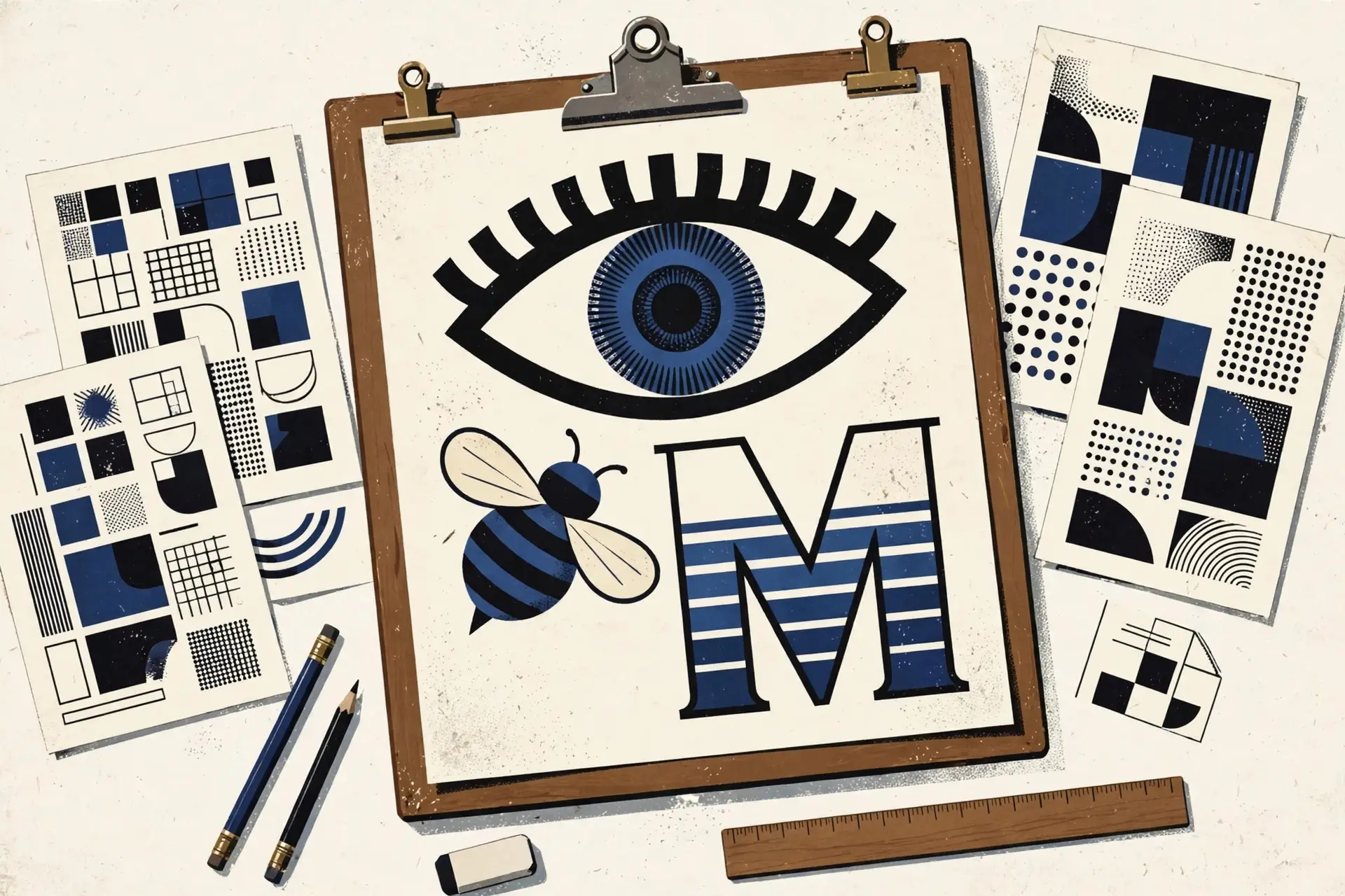
Play was allowed, but it had to wait its turn. Rand’s eye-bee-M rebus was an idea he said he had “right away, as soon as I started to work for IBM”. It did not appear until 1981, as a poster. IBM notes that the rebus is now in the permanent collection of the Museum of Modern Art in New York. Twenty-five years of earning trust before the joke. That sequencing is a design decision too.
What I take from it, rebuilding my own site by hand
I am rebuilding iamarchie.com by hand in Sitely while studying design, working in a fixed palette of turquoise, yellow and white. The temptation, every single week, is to add. A new effect. A new type treatment. One more clever thing.
The Paul Rand design principles underneath that work, if you can call a set of working habits by so grand a name, point the other way. Decide what the mark has to do — different, attractive, memorable, adaptable — and let everything else go. The Encyclopedia of Design sums up his view bluntly: good design does not date, but bad design does.
Eight stripes have carried a technology company through mainframes, personal computers and cloud services without needing to become something else. The letters just kept showing up, cut with lines borrowed from the bottom of a legal document, doing their job.
That is the standard worth stealing. Not the stripes. The patience.